This is one of the first shots we see. Immediately we get a glimpse of the Scorpion jacket, we see little else but a dark reflection and splash of pink.
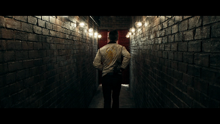
This is towards the end of the film. We see the iconic jacket, the driver walks down the hall light by show lights towards a blood red curtain. His show is about to start.
Contrasting to a lot of the rest of the film, when we enter Irene's home the colours are muted and bland. The top she wears makes her blend in with the walls. I think this reflects a lot about her character, being fairly small and unheard.
We see very little of the Driver's house. His character says very little, and often appears half in shadow. The choice to show very little of his home - and what we do see shows only the necessary items and practical tools - reflects this.


No comments:
Post a Comment